

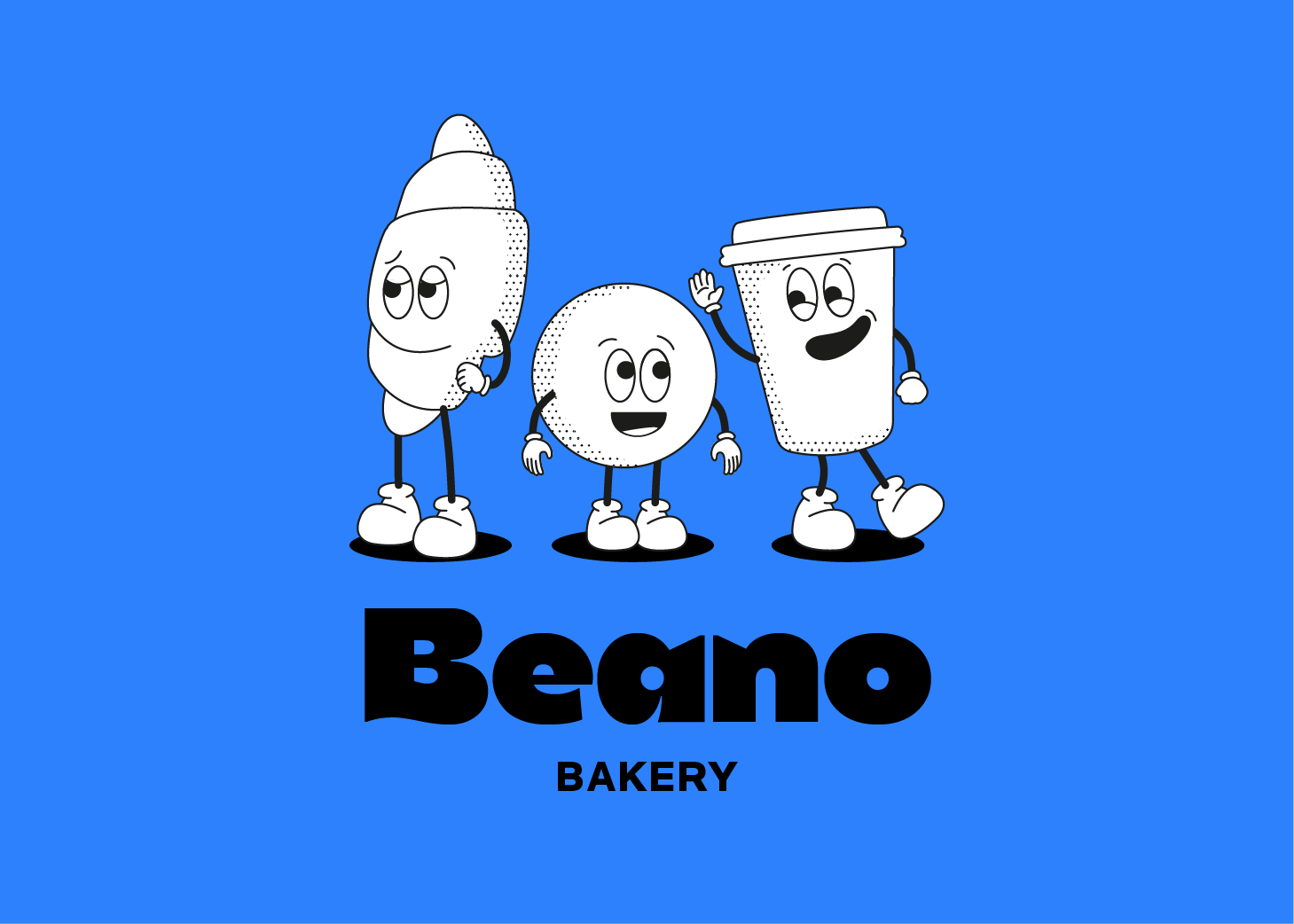
Popin
Building a welcoming yet reliable brand by finding a balance between a relaxed and structured visual identity.
naming
visual identity

CLIENT
Popin is a cosy "grab and go" destination designed for people seeking a quick, quality break in their busy days.
project
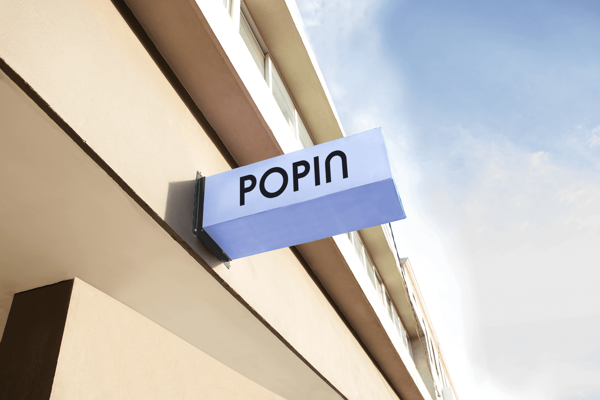
The brand needed a smart-casual identity: structured enough to feel reliable, but relaxed and inviting to match the spirit of popping in at any time.
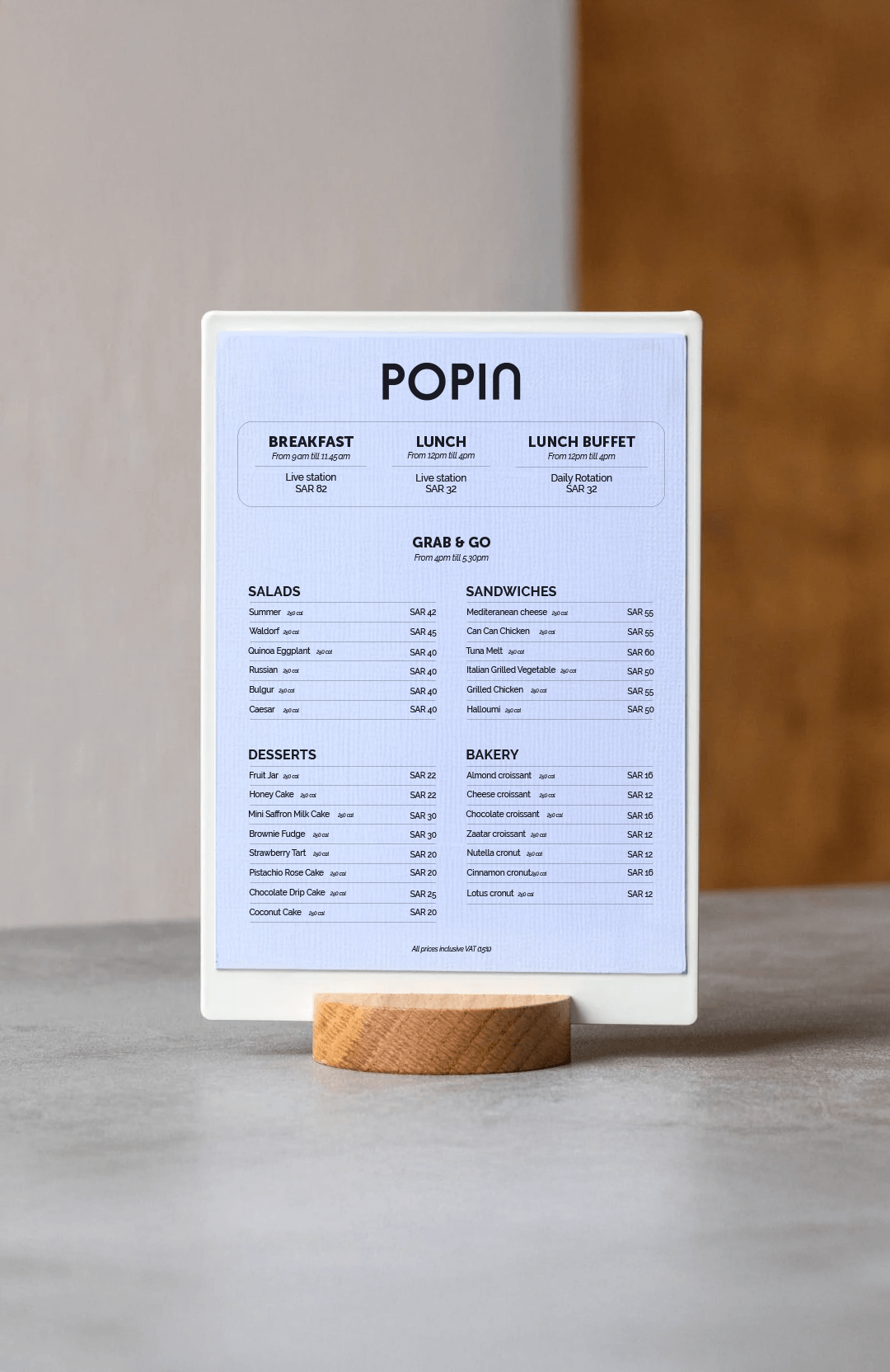
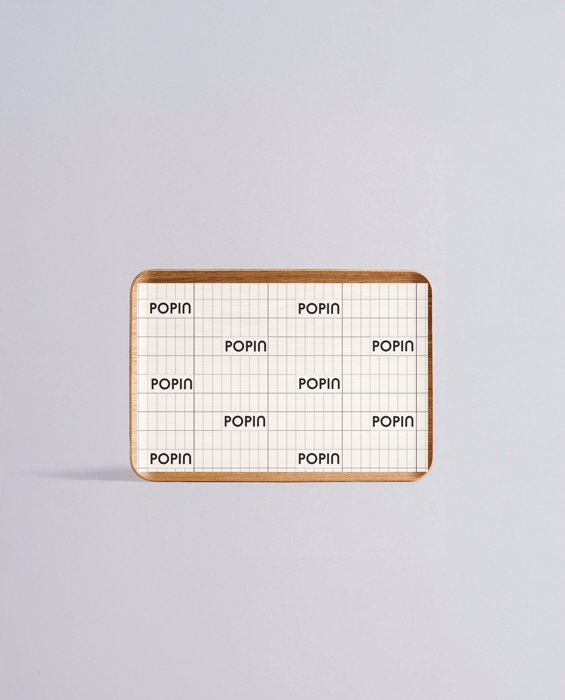
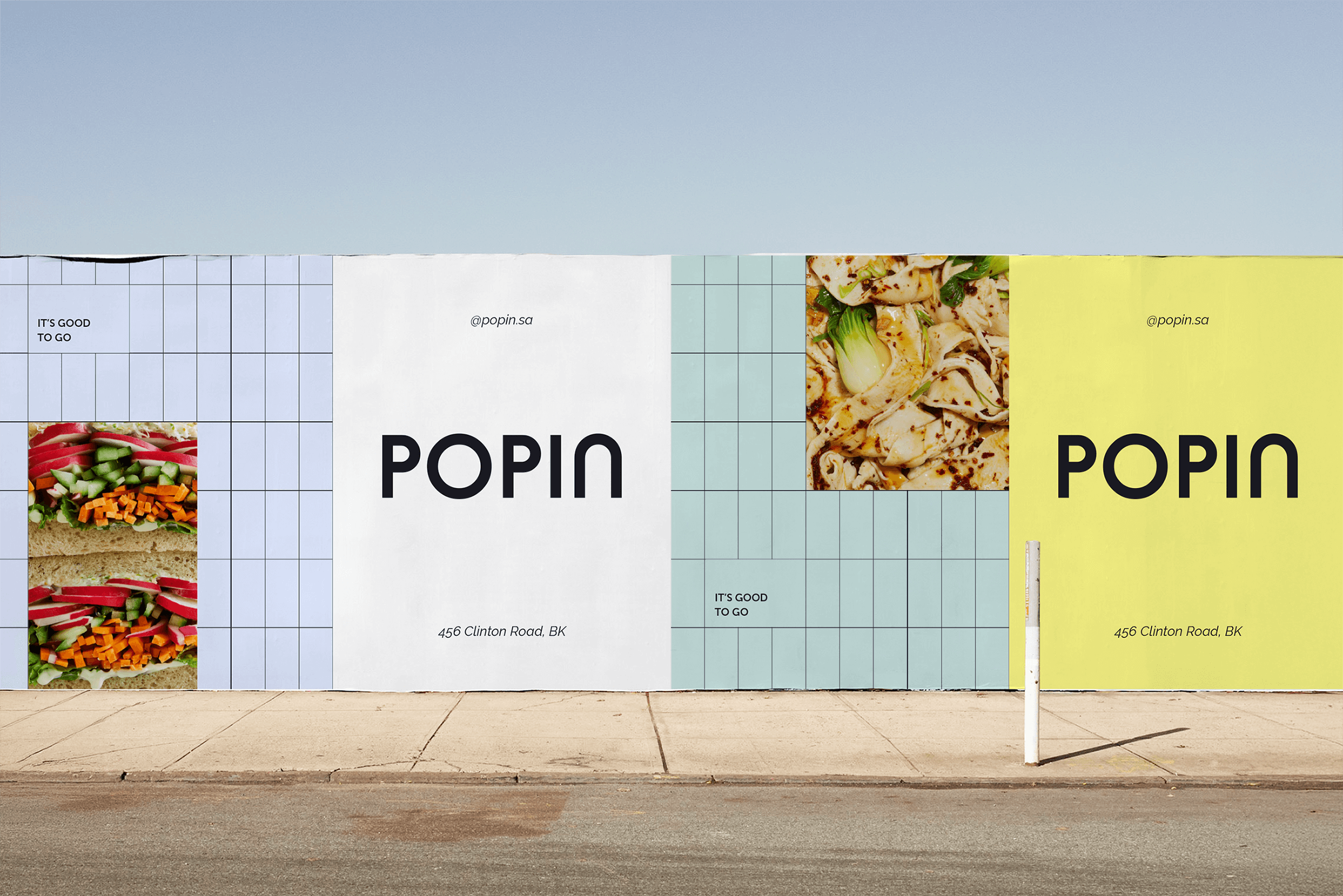
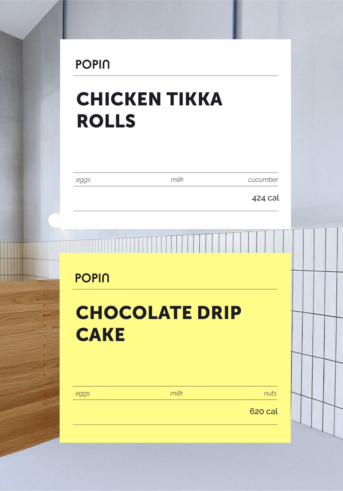
A light, modular grid underpins the layouts across all applications bringing a sense of organization and simplicity. Over this, colorful photography and soft colors inject warmth and vibrancy, avoiding anything too corporate or rigid.
The minimalistic layout approach lets key information breathe, reinforcing clarity and ease of navigation — important in a fast-paced "grab and go" context.
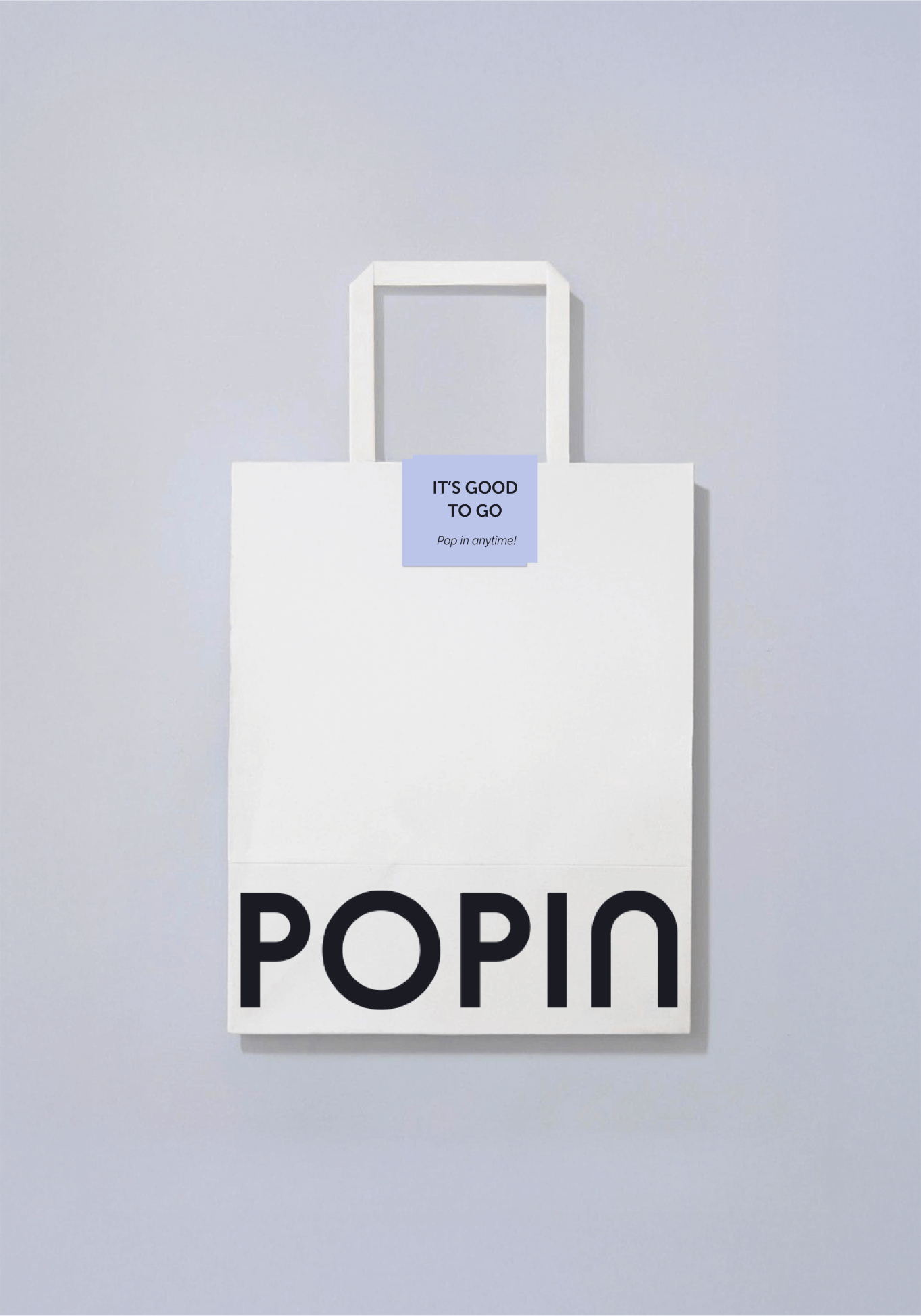
Popin’s brand identity invites passers-by to feel confident and welcome, creating a space that is not only good for a quick meal but also for a small, refreshing pause in the day. It’s good to go — and even better to stay a little longer.

© Anaëlle Gobé 2025.

Popin
Building a welcoming yet reliable brand by finding a balance between a relaxed and structured visual identity.
naming
visual identity

CLIENT
Popin is a cosy "grab and go" destination designed for people seeking a quick, quality break in their busy days.
project
The brand needed a smart-casual identity: structured enough to feel reliable, but relaxed and inviting to match the spirit of popping in at any time.
A light, modular grid underpins the layouts across all applications bringing a sense of organization and simplicity. Over this, colorful photography and soft colors inject warmth and vibrancy, avoiding anything too corporate or rigid.
The minimalistic layout approach lets key information breathe, reinforcing clarity and ease of navigation — important in a fast-paced "grab and go" context.
Popin’s brand identity invites passers-by to feel confident and welcome, creating a space that is not only good for a quick meal but also for a small, refreshing pause in the day. It’s good to go — and even better to stay a little longer.


Ready to elevate your brand to new heights?
© Anaëlle Gobé 2025.
Anaëlle Gobé.
Work
About
Contact

FR

Popin
Building a welcoming yet reliable brand by finding a balance between a relaxed and structured visual identity.
naming
visual identity

CLIENT
Popin is a cosy "grab and go" destination designed for people seeking a quick, quality break in their busy days.
project
The brand needed a smart-casual identity: structured enough to feel reliable, but relaxed and inviting to match the spirit of popping in at any time.
A light, modular grid underpins the layouts across all applications bringing a sense of organization and simplicity. Over this, colorful photography and soft colors inject warmth and vibrancy, avoiding anything too corporate or rigid.
The minimalistic layout approach lets key information breathe, reinforcing clarity and ease of navigation — important in a fast-paced "grab and go" context.
Popin’s brand identity invites passers-by to feel confident and welcome, creating a space that is not only good for a quick meal but also for a small, refreshing pause in the day. It’s good to go — and even better to stay a little longer.

Ready to elevate your brand to new heights?
© Anaëlle Gobé 2025.